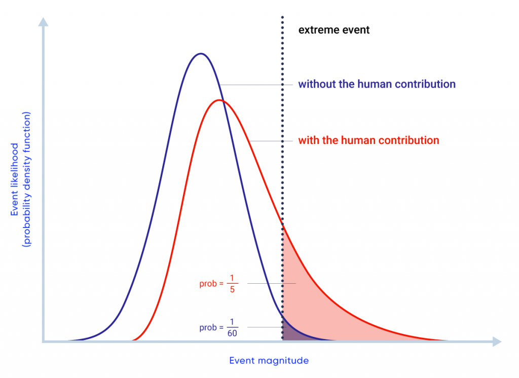
Figure-4.21: Hypothetical illustration of event attribution


The blue distribution represents the possible values of a climate variable in a world without a human influence. The red distribution represents the possible values of the same variable in a world with the human contribution. The shaded areas indicate the probability of experiencing an extreme event (defined by the dashed vertical bar) in each scenario.